Summary
Meta Description: Boost your conversions with our expert guide to landing page conversion optimization. Learn to craft persuasive copy, design for users, and implement smart A/B testing.
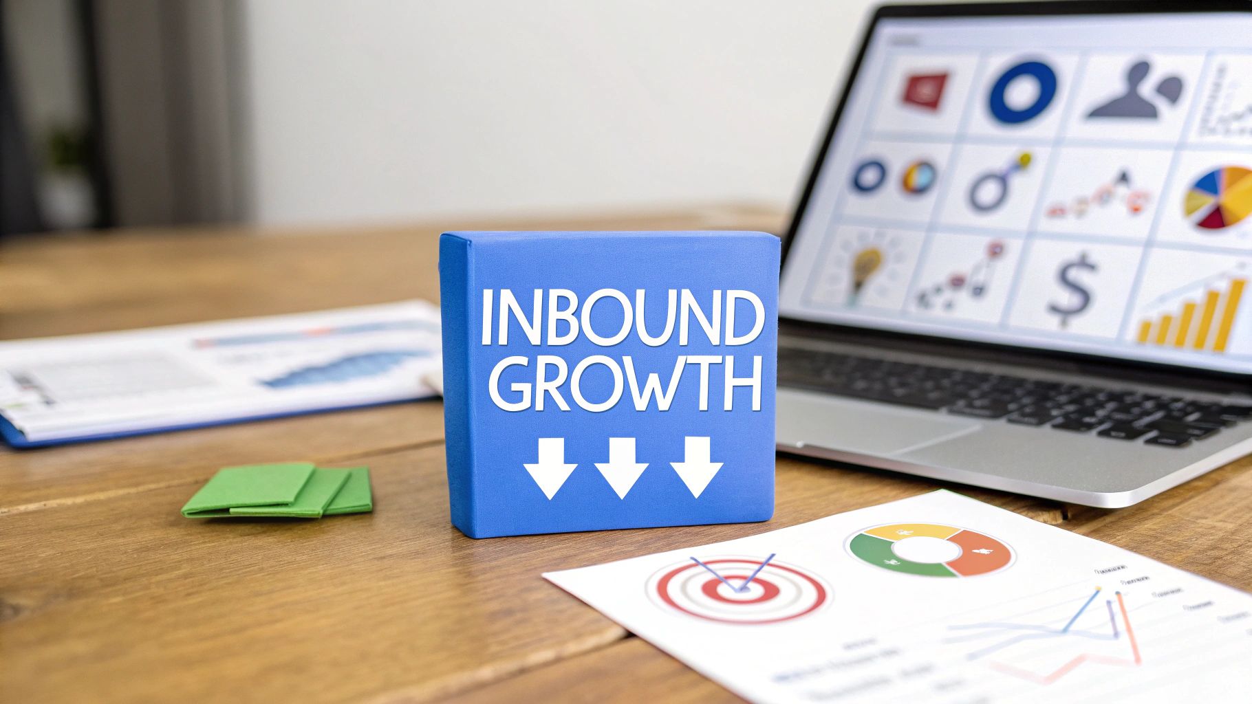
Is your landing page traffic high but your conversion rate low? You're not alone. The secret isn't more traffic; it's making the traffic you already have work harder. This is the core of landing page conversion optimization. It’s the art and science of systematically refining your page—the copy, design, and user experience—to persuade more visitors to take the one action that matters most.
Simply put, it’s about turning more clicks into customers. Ready to learn how?
Building Your Foundation for High Conversions
Before you start tweaking button colors, you need a rock-solid foundation. Great landing page conversion optimization isn't about random changes; it's about creating a seamless journey that guides visitors from click to conversion. How do you build that journey?
It starts with a single, powerful conversion goal. What is the one thing you want visitors to do on this page? Generate leads? Sell a product? Book a demo? Trying to do everything at once only creates confusion. A focused goal simplifies every element on your page, from the headline to the call-to-action, making the desired action obvious.
What Is a Good Landing Page Conversion Rate?
You have a goal, but how do you measure success? Understanding industry benchmarks is key to setting realistic targets. A "good" conversion rate varies dramatically by industry, so knowing where you stand is crucial.
This infographic provides a quick snapshot of what to expect, comparing average performance to the top players.

As you can see, a massive gap exists between average and elite performance. That gap is where your optimization efforts will make the biggest impact.
While the median conversion rate across all industries is around 6.6%, this number is just a starting point. For instance, a B2B page might see rates closer to 1%–3% due to longer sales cycles, while some B2C pages can average an impressive 9.9%.
Here’s a breakdown of average and top-tier conversion rates to help you set clear goals.
These figures show that the top 10% of landing pages achieve conversion rates of 11% or higher, proving that a dedicated optimization strategy delivers powerful results.
The Power of Strong Message Match
One of the most critical foundational elements is message match. The concept is simple but powerful: the promise you make in your ad must be instantly reflected on your landing page.
If someone clicks an ad for "50% Off Running Shoes," they should arrive on a page that prominently features that exact offer. Any disconnect creates confusion and destroys trust. Why is this so important?
A strong message match builds instant trust and reassures visitors they are in the right place. A mismatch creates cognitive dissonance, causing confusion and leading to high bounce rates.
Think of it as a conversation. Your ad starts it, and your landing page must continue it seamlessly. This consistency is fundamental to keeping users engaged and moving them toward your conversion goal.
For a deeper dive, check out the ultimate guide to building ecommerce landing pages that actually convert.
Designing for Persuasion and User Experience
Great design does more than just look good—it persuades. Effective landing page conversion optimization hinges on a design that intuitively guides people toward your goal. It's not about flashy graphics; it's about the subtle psychology of user experience (UX) and telling a clear visual story.
This starts with a powerful visual hierarchy. You must arrange content so a user's eye naturally lands on the most important elements, like your headline and call-to-action (CTA) button. You are creating an obvious path for your visitor to follow.
How Users Actually Scan Your Page
Here’s a hard truth: most visitors don't read your landing page. They scan. They’re looking for quick clues to decide if your offer is relevant. Understanding their scanning patterns allows you to structure your layout for maximum impact.
What are the most common behaviors?
- The F-Pattern: On text-heavy pages, users scan across the top, move down slightly for another horizontal scan, and then read down the left side. It looks like the letter 'F'.
- The Z-Pattern: Common on simpler, more visual pages. The eye moves from top-left to top-right, cuts diagonally to the bottom-left, and then moves across to the bottom-right. This pattern is perfect for connecting your headline, hero image, key benefits, and CTA.
By aligning your most critical information along these natural eye paths, you ensure your core message gets seen.
The best landing page designs just feel right. They anticipate the user’s next question and have the answer waiting exactly where they expect to find it. That's what creates a seamless and persuasive journey.
Crafting a Compelling Call to Action (CTA)
Your CTA is the single most important button on the page. Its design and copy can make or break your conversion rate. Too many pages fail with boring, generic CTAs like "Submit" or "Click Here." They don't inspire action because they communicate zero value.
So, how do you fix it? Your CTA copy must be specific and highlight the benefit. A great trick is to have it complete the sentence "I want to..." from the user's perspective.
- Don't use "Submit." Use "Get My Free Quote."
- Instead of "Download," try "Claim My Free Ebook."
- Upgrade "Sign Up" to "Start My 14-Day Trial."
This simple switch makes the action feel rewarding. As for the button itself, use a contrasting color that grabs attention while fitting your brand’s palette. Make it impossible to miss.
Building Trust and Credibility Instantly
Before anyone converts, they have to trust you. Trust signals are the visual cues you place on your page to build that credibility. Strategically placing these elements can reassure visitors that your offer is legitimate and their information is safe.
What are the must-have trust signals?
- Client Logos: Showing well-known companies you've worked with provides an instant authority boost.
- Customer Testimonials: Real quotes from happy customers add a human touch and powerful social proof.
- Security Badges: Displaying SSL certificates or payment processor logos (Visa, PayPal) is non-negotiable for e-commerce.
- Awards or Certifications: Any industry recognition reinforces your expertise.
Sprinkling these near your CTA can provide the final nudge a hesitant visitor needs. For inspiration, explore these powerful social proofing examples.
Crafting Landing Page Copy That Actually Sells

A great design might capture attention, but it's the words on the page that convince visitors to act. Your copy is your 24/7 salesperson. It connects with your audience, builds desire, and drives conversions. Real landing page conversion optimization comes down to copy that sells the transformation, not just the product.
Everything starts with your headline. It's your one chance to hook a visitor in the first three seconds. A weak headline guarantees the rest of your page will be ignored. What makes a headline great? It must be benefit-driven, ultra-specific, and speak directly to a visitor's problem.
Writing Headlines That Stop the Scroll
Forget cleverness. Clarity always wins. Your visitor must immediately understand what's in it for them. An effective formula is to state the desired result while hitting on a major pain point.
Instead of a boring headline like "Advanced Project Management Software," try something with punch: "Organize Your Team's Chaos in One Afternoon."
Do you feel the difference? This version promises a clear benefit (organization), tackles a specific pain point (chaos), and gives a tangible timeframe (one afternoon). It's not about what your product is—it's about what it does for the customer.
From Features to Benefits: A Simple Guide
One of the most common copywriting mistakes is listing features instead of explaining their benefits. People don't buy a drill because they want a drill; they buy it because they want a hole in the wall. Your copy needs to connect those dots for them.
Here’s a simple way to translate dry features into compelling benefits:
- Benefit: Keep your private data completely secure and safe from prying eyes.
- Benefit: Master a new skill at your own pace, whenever it fits your schedule.
After you write a feature, ask yourself, "So what?" The answer is your benefit. This trick forces you to think from your customer's perspective.
Using the PAS Framework to Persuade
When structuring your body copy, the Problem-Agitate-Solution (PAS) framework is a classic for a reason. It taps into human psychology by creating an emotional journey.
Here’s how it works:
- Problem: Identify a pain point your ideal customer faces. Get them nodding in agreement.
- Agitate: Don't stop there. Amplify the problem. Describe the frustrations and negative feelings it causes.
- Solution: Present your product as the clear, simple solution that makes all that pain disappear.
By framing your offer as the answer to a real, frustrating issue, you position it as a "must-have" instead of a "nice-to-have." This builds urgency and makes your call to action feel like the only logical next step.
This structure guides your reader from pain to relief, making your solution feel like a lifesaver.
Implementing a Smart A/B Testing Strategy

You've built a solid foundation, designed a persuasive layout, and crafted compelling copy. Now what? It's time to stop guessing and start knowing what works. This is where a methodical A/B testing strategy becomes the heart and soul of landing page conversion optimization.
This is how you move from "I think this will work" to "I have data that proves this works."
A/B testing, or split testing, is a straightforward concept. You create two versions of your page: version "A" (the control) and version "B" (the challenger with one single change). Then, you split your traffic between them to see which one converts better. It's the simplest way to let your audience vote with their clicks.
How to Formulate a Strong A/B Test Hypothesis
Every great test starts with a strong hypothesis, not a random idea. A good hypothesis is an educated guess based on insights from your user data, analytics, or customer feedback. What's the best way to frame it?
Use this simple formula: “If I change [X], then [Y] will happen, because [Z].”
For instance, a weak idea is, "Let's test the button color."
A strong hypothesis is far more specific: "If we change the CTA button color from blue to high-contrast orange, then click-through rates will increase, because the button will stand out more and create a stronger sense of urgency." This gives your test a clear purpose and a measurable goal.
Pinpointing High-Impact Elements To Test
While you can test almost anything, not all elements are created equal. Some changes deliver huge wins, while others barely move the needle. To get results faster, focus your energy on the heavy hitters first.
Where should you start for the best results?
A/B Testing Priorities for Maximum Impact
This table is a solid starting point for getting the most out of your initial testing efforts.
How to Sidestep Common A/B Testing Pitfalls
Running a clean test requires discipline. It’s easy to make a mistake that invalidates your results.
One of the biggest blunders is ending a test too early. You get excited when one version pulls ahead and declare a winner. Don't do it! You must let the test run long enough to reach statistical significance—meaning the results are highly unlikely to be due to random chance.
Another classic mistake is testing too many variables at once. If you change the headline, hero image, and button color, you’ll have no idea which change made the difference. Stick to testing one element at a time. It may feel slower, but it provides clear, actionable insights.
The real goal isn't just to find a single "winner." It's to create a continuous feedback loop where every test—win or lose—teaches you something new about your audience.
For a deeper dive, our complete guide on A/B testing for landing pages covers the framework in much more detail.
Finding Actionable Insights in Your Landing Page Data
Your analytics platform is a goldmine for conversion opportunities, but only if you know where to look. Raw numbers like sessions and bounce rates are just the beginning. Real landing page conversion optimization starts when you look past these surface-level stats to understand the human behavior behind them.
The goal is to connect the "what" from your data with the "why" from real user interactions. This combination fuels powerful, data-driven hypotheses for your A/B tests.
How to Uncover User Behavior with Visual Tools
Analytics tell you people are leaving, but visual tools show you where and why. Heatmaps are a perfect example. They paint a clear picture of where users are clicking, tapping, and moving their cursors. You can instantly spot if your main CTA is being ignored or if users are clicking on non-clickable elements.
Scroll maps are just as revealing. They show you exactly how far down the page most people get. If a critical section with trust badges is below the point where 75% of your audience drops off, it might as well not exist. These insights are direct, powerful, and incredibly actionable.
As you explore tools, it's smart to see what different platforms offer. For example, look at Screenask's conversion optimization features to see how varied analytics can support your strategy.
Watching Real User Journeys
Want to go a step further? Session recordings provide a front-row seat to a user's experience. You can watch them hesitate over a form field, rage-click a broken button, or scroll endlessly trying to find information. It's an eye-opening experience.
I’ve learned more about UX issues from watching a handful of session recordings than I have from dozens of spreadsheets. These recordings expose the hidden friction points that analytics alone will never show you.
This is how you uncover the bugs, confusing copy, and awkward design choices that are silently killing your conversion rates.
Gathering Direct Qualitative Feedback
While observing behavior is crucial, sometimes the fastest way to understand a user is to just ask. You don't need a massive survey. A simple on-page poll can work wonders.
Try adding a small pop-up that asks a single, pointed question. For example:
- "What's the one thing stopping you from signing up today?"
- "Was there any information you couldn't find on this page?"
- "How would you rate your experience on a scale of 1 to 5?"
When you combine this direct feedback with your quantitative data, you start to see the full picture. It ensures you're tracking the right metrics and focusing on what truly matters. If you need a refresher, our guide on choosing the right KPI for a website can help.
Common Landing Page Optimization Questions Answered

As you dive into landing page optimization, a few key questions always come up. Getting these answers right from the start will help you avoid common pitfalls and keep your strategy on track. Let's tackle them head-on.
A common question is: "How often should I be testing?" There's no single answer; it depends on your traffic volume. A high-traffic page might have enough data to run a new test every week. In contrast, a lower-traffic page may need to run an experiment for a full month to get statistically sound results.
How Many Changes Should I Make at Once?
This one is absolutely critical. It’s tempting to change everything at once—a new headline, hero image, and button color—but that's a classic rookie mistake. If you change more than one thing, you have no way of knowing which change actually impacted the results. Was it the headline? The image? You'll never know.
The key to clean, reliable data is the one-variable rule. Only test a single element at a time. It might feel slower, but this is how you get clear, actionable insights you can confidently build on.
Once a test produces a clear winner, that version becomes your new control. From there, you just pick the next element and start a new test. This iterative cycle is the secret to building a truly high-converting page.
When Should I Stop an A/B Test?
Knowing when to end a test is another common challenge. Many marketers get excited when one version pulls ahead after a few days and they stop the test early. This is a surefire way to get a false positive based on random chance.
To do it right, your test needs to hit two key milestones:
- Statistical Significance: Aim for a confidence level of at least 95%. This means you are 95% certain the results aren't a fluke.
- Sufficient Sample Size: You must let the test run long enough to gather a meaningful amount of data. This ensures your results reflect your actual audience, not just the early adopters.
Don't let impatience sabotage your efforts. A disciplined testing process is what separates decisions based on solid evidence from those based on a gut feeling.
Ready to stop guessing and start building landing pages that actually convert? LanderMagic uses AI to create dynamic, high-performing landing pages tailored to your Google Ads campaigns. Start your free trial today and see the difference for yourself.